Products You May Like
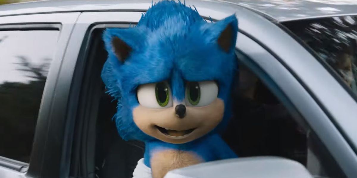
This morning we saw the new trailer for the Sonic the Hedgehog movie. While most second movie trailers are mostly focused on giving us a bit more detail on the characters and the plot, the purpose of this trailer is really to show off the new look of the main character.
Sonic has undergone a complete redesign following a pretty loud backlash to the character’s original look. This morning it appears people are liking the new look a lot more than the old one. So what exactly got changed? Let’s take a closer look at everything that different between the old and new Sonic the Hedgehog.
Sonic’s Face
Most of the differences in the new Sonic the Hedgehog that influence the rest of the redesign can be seen in Sonic’s face. The original concept for Sonic was to make him look, for lack of a better word, real. The hair on Sonic’s face, beyond being bright blue, looks like it could be on a real animal. The face is wide, giving Sonic a bit more of an aerodynamic head, which makes some sense, but just never sat right with fans.
The new Sonic has a bit more of an animated look. The head has been shrunk horizontally and enlarged a bit vertically. This has the effect of making the eyes rounder, which makes Sonic automatically more friendly looking. His nose is also smaller in the new look. In this particular image, the lighting has also been changed, to make Sonic brighter over all.
The Hands
If there was a single place where the old Sonic the Hedgehog design made people absolutely scream in uncanny valley terror, it was the hands. As seen in the image above, Sonic had strangely human hands. Five long fingers that were covered in white fur, but were still, without question,hands based on that of a person. It’s all sorts of wrong and creepy.
In the simplest imaginable fix, the new Sonic the Hedgehog has simply been given gloves. It’s the way the character has been seen in video games and animated series in the past, so it makes all the sense in this world. Perhaps Sonic still has weirdly human fingers, but as long as keeps his gloves on and we don’t have to see them, we’ll call it good.
The Teeth
Similar to Sonic’s oddly human hands, the original design gave Sonic oddly human teeth. They just didn’t seem to fit right in that mouth. They looked too big for his mouth and they only added to the strange mixture of human and animated character that made the whole thing difficult to look at.
The new Sonic fixes the teeth issue by basically removing them. Most of the time when Sonic opens his mouth in this trailer you can’t actually see any teeth. His mouth is just a black hole like most cartoon characters. Occasionally, we will catch a glimpse of Sonic’s teeth, so we know he has them, but it’s always just a slight view like the image above. This is much better.
General Proportions
Of all the things that weirded me out with the original Sonic design, the one that really bothered me was Sonic’s oddly lanky frame. He had these strangely long legs and skinny frame. Like most of these decisions made on the first go round, I’m sure it made sense at the time. Sonic is a runner, so giving him long legs makes sense, but, as is obvious here, it just don’t work in practice. He also appears to have human feet, as defined by the fact that he’s wearing normal sneakers.
With Sonic’s redesign his legs aren’t quite as long, and he looks just better proportioned all around. He’s also no longer wearing standard running shoes, which helps him look more like an animated character and less like a person.
Based on the reaction on social media, it seems nearly everybody is much happier with the design of Sonic the Hedgehog now than they were previously. As far as that goes, it looks like the delay in the release of the film was time well spent. Of course, the movie still looks pretty corny, and while Sonic looks a lot different, he still acts and sounds very much the same. Whether the visual change is enough to draw people to the theater is very much an open question.
Sonic the Hedgehog is set for release on February 14, 2020.
