Products You May Like
Comic book adaptations are a risky business; even after the success of the Marvel Cinematic Universe. Or maybe it’s in spite of? Not every comic book adaptation needs to be about superheroes—they are simply the most accessible for the mainstream. The biggest difference between comic book adaptations and other book adaptations is how comic books already have the visual right there on the page. Mess with that and it doesn’t matter how magnificent everything else is, you will always be known as the person who created “Adaptation Injustice”.
“Adaptation Injustice”
The best panel discussion of Sydney Oz Comic Con 2019 goes to “Adaptation Injustice”, about the best and worst comic book adaptations. The stage featured writer Tom Taylor and artist Nicola Scott (confession: it also featured two more participants introduced at the last minute. Unfortunately I didn’t catch their names and the website schedule has not been updated. Sorry!).
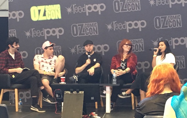
The discussion was filled with passionate views on both comic books and adaptations; not surprising with the experience of those on stage. It had me thinking about the culture behind reading comic books. Whether an adaptation is good is purely dependent on how the director thinks the comics are read. If there is respect for how they think we read the book, then there will be respect for the adaptation.
If they think the readers are only there for the pictures…well, there has been enough disappointment over the years. How about we move on to some other form of inspiration?
What Makes a Good Comic Book Adaptation?
How do you read your comics? Is it for the pictures? Is it for ‘forced patience’ between single issues? Or are you a sucker for particular genres that simply don’t carry over as well in general literature? No judgement here whatsoever. Reading styles differ from person to person, and often from book to book.
Full solid confession: I never appreciated Sense and Sensibility until I read it as a graphic novel. I simply couldn’t picture the staged behaviour of certain characters because I lacked the visual understanding of the time period. On the other hand, I absolutely adore Saga and cannot imagine how densely complex it would be to present all of THAT into text-only. The way it is presented in the panels with the art adds a special tone to the story. Never ever break the partnership of Brian K. Vaughan and Fiona Staples within the Saga Universe. Ever.
The key comes down to entertainment. Can we entertain the loyal fans and the newbies at the same time? Can we capture the same visual impact from the comics? Should we stick to canon storylines? Do we need to match our casting perfectly? For comic books, it is easier to start with the physical book itself.
Panel-for-Panel
When adapting a comic book to movie or television, most of the visual work has already been done. We have seen Wonder Woman’s physique in the comics. We have seen the bloody splatter on the ‘Smiley’ pin for Watchmen. It makes it so easy to fall into the trap of creating a movie or series that plays out panel-for-panel. This works for some, but let’s be honest; the successes are few and far between.
Absolute panel-for-panel representation in movies often feels like pandering to the fans, leaving very little room for creative interpretation. Scott Pilgrim vs The World is a great example of this. It is considered by many (including the Oz CC panel) to be The Most Underrated Comic-Book Adaptation of all time. The story itself is inspired by computer games, with the main character’s life resembling a dungeon crawl of battles to win the heart of the maiden. O’Malley’s story was so filled with computer game influence, much of the movie would have lost its charm and reference if they had not incorporated Edgar Wright’s visual style directly. On the other hand, people not familiar with the source material may not be as convinced of its genius. I guess you had to read it first.
On the other hand, it’s a little worrisome when the author says the director completely missed the tone in their ‘panel interpretation’. Blue is the Warmest Color received rave reviews for both the book and the movie, in its portrayal of love and heartbreak between two young women. Book Rioter Nikki listed the kissing scenes as number 2 in the ‘Most Romantic On-Screen Smooches in Movies Based on Books’. It was the first graphic novel adaptation to win the Palme d’Or at the Cannes Film Festival. Unfortunately, the movie adaptation is mostly recognised for its sex scenes.
Panel-for-panel, the first sexual interaction between the two main characters takes four pages. It features moments and pauses and intimacy between the two as they work through the raw passion of this first encounter. The movie scene takes seven minutes and leaves a very awkward feeling of ‘male gaze’. The director claimed he was being true to the panels of the book, making it look “beautiful” rather than a natural pull of passion. The original author, Julie Maroh, objected to the scenes as being “lesbian spectator”. For Maroh, it was another example of the movie differing from the book. In this case, the director is entitled to his artistic licence but when the tone of the story is lost, you need to question if it is an adaptation of the comic book or simply a movie based around the director’s favourite panels.
The Tone of the Storyline
Whether or not it’s based on a comic book, a movie needs a good storyline to succeed. Without the panels, you need to create your own flow and visual cues for how the story moves. As an artist, Nicola Scott is very familiar with capturing tone and essence in her panels. Her best example for this point is the history of Superman movies.

For Scott, Superman (1978) is the best of the Superman movies because it makes you feel something. When Reeves steps out for the first time in his outfit, he carries an air of purpose. From the casting to the dialogue and the scene-setting in between, everything with it carries the essence of Superman. Umberto Eco could never have asked for a better movie to make his point about the importance of archetypes.
In contrast, Superman Returns and Man of Steel simply could not compare. The movie Superman Returns sucks. It truly does. Brandon Routh tried to make the best of a bad situation, but the story is downright horrible. At least the mix of music and visual cues at least had you feeling something. It left you feeling like it was a Superman movie, albeit a half-arsed one.
That’s still better than Man of Steel. Henry Cavill is a great Superman, Amy Adams is a good actress but not really a Lois Lane. The story is okay…but the movie has no feeling. Even cherry-picking a few quotes and panels from comic-book canon, Man of Steel does not carry the ‘hope’ of Superman. The storyline does not have to replicate a comic book arc perfectly; consider some Marvel Cinematic Universe movies, influenced but not solely based on the source material. However, if you want to make any money from this, you need to attract the fans AND entertain the freshman. You need to move them out of their seats and into the comic-book stores, seeking out the source material.
Casting is Everything
So if a director says no to panel representation, and no to canon storyline, their hope for success is riding on the cast.
The majority of superhero movies have been pretty good with this. Many fans believe Robert Downey Jr. is the foundation for all of the MCU accolades. His casting was genius. Pure genius.
Casting a character is more about the soul of the character than the appearance. In the same way panels do not always dictate how we see the movie, actors do not have to look exactly like their comic book counterparts to convince us they are the character. Tessa Thompson’s casting as Valkyrie was cinematic magic. She is not the stereotypical representation of a Nordic Viking Warrior-Angel but she shines like a Summer Solstice in Thor: Ragnarok. Why? Because she personifies all of the aloofness and strength and honour associated with the Marvel characterisation of Valkyrie. Panels in a comic book give us the visual cues for how the story moves along the pages. Characters are the same; they are visual cues but not always a set vehicle. And let’s face it – not all characters are going to carry to the big screen.
Are Comic Book Adaptations a Money Pot?
Even if you do nail all three elements, there is still no guarantee your comic book adaptation will be a success. Visual prompts can only take you so far, and some comic-books simply are not translatable to the big screen. Some not even for the smaller screen. Like any other medium, there is a plethora of inspiration available. While I am adamant about leaving Saga the hell alone, here are some other suggestions for comic-book to movie/television adaptations:
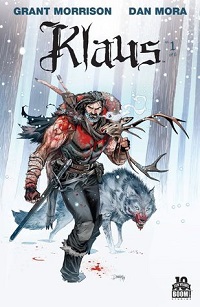 Klaus by Grant Morrison and Dan Mora
I think we have all have earned a good Santa Claus movie at some stage in our lives, thank you very much.
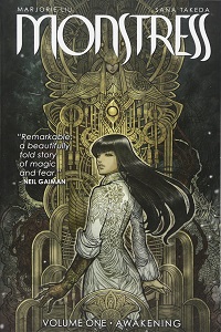 Monstress by Marjorie Liu and Sana Takeda
I need this as a television series so I can wrap my head around the detailed mythos. My only concern is the SFX capturing the magic.
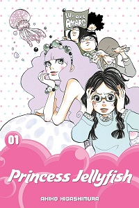 Princess JellyFish by Akiko Higashimura
The social awkwardness of nerds in Japan is perfect for the smaller screen, playing out a little more character growth in each episode.
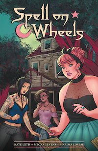 Spell on Wheels by Kate Leth and Megan Levens
Road tripping witches chasing down some thieves with their stolen magical items. It screams “Make Me a Movie”.
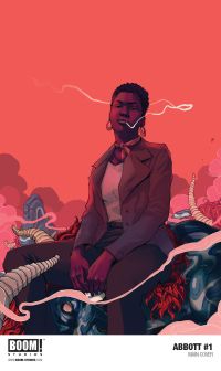 Abbott by Saladin Ahmed and Sami Kivela
A live-action reminder of how badass journalists can be when investigating the hard stories others would prefer to ignore. Set in 1972 Detroit, viewers would easily see the correlation with today’s social issues.
What would you add to the list? Give us your best ideas on social media. Maybe someone will come and steal our ideas. We can live in hope.
By signing up you agree to our Terms of Service
